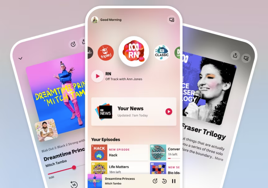
Anytime the national broadcaster makes a significant change, debate is fierce. The redesign of ABC Listen, while superficially small, was to address underlying shortcomings in the user experience of the app.
In a blog post, Alex Bilbie-Clarke, product manager on the ABC listen app, and Danny Webster, the design lead for audio, talk about the context, statistical justification and evaluation of the redesign.
The context
ABC listen was originally built to be a radio app, but over the years has incorporated podcasts, music, news and audiobooks.
The additions needed to work well together. Instead, it was becoming an assortment of mixed goods, with no cohesive and strategic plan binding them.
This led Bilbie-Clarke and Webster to conclude:
“Enough new stuff, it is well and truly time to tighten up our core experience – getting to audio and listening to it.”
Statistical Justification
As pandemic laden news cycles decreased, users were returning to the listen app less.
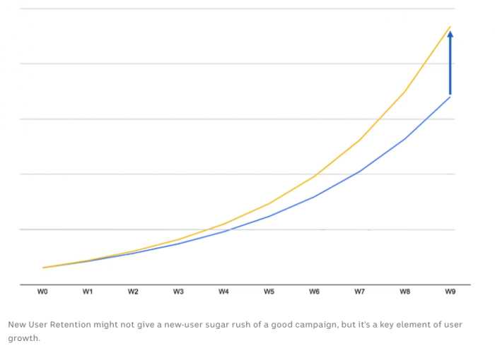
A three-week user retention, that is the percentage of users who are still using the app three weeks after downloading it, is one of the most significant ABC “app health” statistics.

With so many offerings besides news, the gaps demonstrated in this graph indicated issues perhaps in the user experience.
Existing users had said in surveys they really liked the design. Younger prospective users however, in research sessions, initially would say that that the app “wasn’t for them”. They liked the look of it, but it wasn’t up to their standards. For the ABC team of designers and non-designers they too felt it wasn’t up to their own.
Since the redesign, and with the recent Digital News Report: Australia showing we are still less interested in news, retention numbers have not only stopped decreasing, but have improved with the app winning a Best In Class at the Good Design Awards.
These are the key takeaways from the team involved:
Quality matters. Building a product that is usable, approachable and beautiful can be an end in and of itself.
Pay attention to your core metrics in the context of broader industry trends. We noticed our retention start to falter and quickly linked this to the news fatigue of the pandemic. This allowed us to start working on this initiative well before the issue became critical.
Design debt is real. There are well established ways to quantify and action tech debt; but it’s equally important to untangle those interface inconsistencies, address those interaction flat spots and recalibrate the experience to ensure your product really is showcasing its core offering.
Have a trusted team with taste. People who you know have a perspective and experience.
Set a singular, punchy and aspirational goal. It doesn’t need to be perfect, but it needs to be easy to repeat all the time with stakeholders.

